Selected class name
Selectable Elements page. "/>Description
This is the CSS class that should be used when the html that is bound to the item is clicked on. You can define CSS Classes on the CSS pane. For more information on how to implement this feature see the Selectable Elements page.
Using a CSS Class on an Item
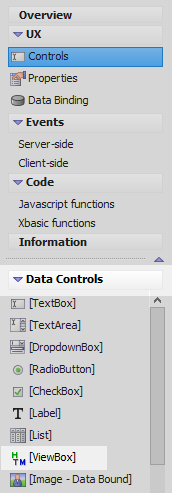
In the UX Builder on the UX Controls page open the Data Controls menu. Click on the [ViewBox] option to add a viewbox control to the component.
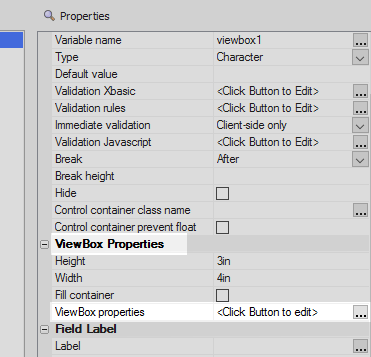
Highlight the viewbox control. In the properties list on the right scroll down to the 'ViewBox Properties' section and click the [...] button next to the 'ViewBox properties' property.
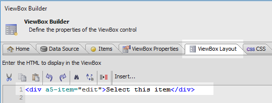
In the Viewbox Builder's ViewBox Layout pane add some HTML and bind this to an item named 'edit'.
<div a5-item="edit">Select this item</div>
On the ViewBox Builder's CSS pane add a class named '.myClass'.
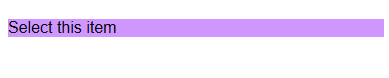
.myClass{
background: #cf96ff;
}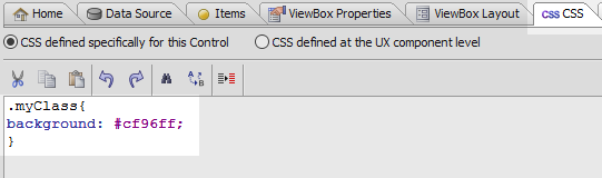
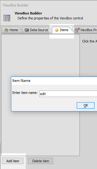
On the ViewBox Builder's 'Items' pane click the 'Add item' button and create a new item called 'edit'.
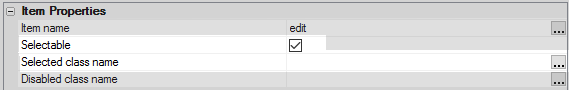
Make sure the 'Selectable' checkbox is checked. Then click on the [...] button next to the 'Selected class name' property.
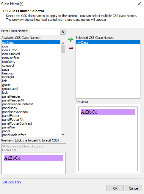
Double click on the '.myClass' CSS class that you defined and click OK. Click OK again to close the ViewBox Builder.
Run the component in Live Preview. When you select the item, i.e. click the HTML, then the CSS class should be displayed.